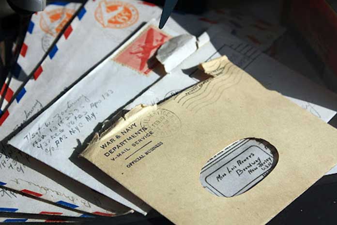
A letterhead is the heading at the top of a letter, usually containing the name and address of the sender and/or the company. It may also include a logo, telephone number, email address, website URL, and other contact information.
A well-designed letterhead can make your correspondence look more professional and eye-catching. In this article, we will share 13 ways to create a professional and eye-catching letterhead design.
1. Use a simple and clean font.
When it comes to fonts, simplicity is key. A clean font will help your letterhead look professional and polished. Some good options include Arial, Calibri, or Helvetica.
2. Use a contrasting color scheme.
If you want your letterhead to really stand out, try using a contrasting color scheme. This will help it catch the viewer’s eye and make a strong impression. Some good color combinations include black and white, blue and yellow, or green and red.
3. Use a professional logo.
A well-designed logo can help your letterhead look more polished and professional. If you don’t have a professional logo, consider hiring a designer to create one for you.
4. Include your contact information.
Be sure to include your contact information on your letterhead, such as your name, phone number, email address, and website URL. This will make it easy for people to get in touch with you.
5. Use images or graphics.
Adding images or graphics to your letterhead can help make it more visually appealing. You can use photos, illustrations, or even icons to add interest.
6. Stick to a simple layout.
When it comes to layouts, less is more. A simple layout will help your letterhead look professional and polished. Try using a single column of text with minimal embellishments.
7. Use complementary colors.
If you want your letterhead to be visually appealing, try using complementary colors. This will create a pleasant and harmonious design. Some good color combinations include orange and green, purple and yellow, or red and blue.
8. Use a unique typeface.
If you want your letterhead to stand out from the crowd, try using a unique typeface. This will help it stand out and make a bold statement.
9. Be consistent with your branding.
If you have a specific branding style, be sure to stick to it when designing your letterhead. This will create a cohesive look and help your correspondence stand out.
10. Use a professional paper stock.
When it comes to paper stocks, it’s best to go with a professional option. This will give your letterhead a high-quality look and feel. Some good options include coated paper, uncoated paper, or recycled paper.
11. Use a stylish envelope.
If you’re sending your letterhead in an envelope, be sure to use a stylish option. This will help it stand out and get noticed. Some good envelope options include colored envelopes, metallic envelopes, or even patterned envelopes.
12. Add a border.
If you want your letterhead to have a more polished look, try adding a border. This will help it stand out and make a visual impact.
13. Use a custom envelope template.
If you want your letterhead to look even more professional, try using a custom envelope template. This will give it a unique and polished appearance.
If you’re looking for a way to make your custom letterhead design appealing, Check out Venngage—a free infographic maker that offers a wide range of online letterhead designs for everyone. Here are some professional letterhead examples from their website!
Creating a letterhead can be a challenge, but it’s definitely worth the effort. By using these 13 tips, you can create a design that will make a strong impression on your viewers.

